
This article is also available as a step-by-step tutorial on my Github here
Motivation for this article
I’ve recently moved to Seattle, WA. Before moving here I had read that the city is known for its gray skies. It’s also famous for having overcast clouds more than 200 days per year. In the few weeks that I’ve been here I’m reminded of this fact almost daily. I became curious: how often does Seattle have gray skies compared to other cities? Because I’m in the tech industry, I was curious about those other cities in the country that are also tech-hubs. I had a nagging suspicion that that the difference in the daily sky colors of Seattle and other tech hubs won’t be too different as the other tech-hubs are also coastal cities.
I had spent the last summer in the Bay Area for an internship and I had noticed that the skies in San Francisco were gray more often than they were blue. I had not expected that at all: I had imagined that San Francisco has sunny days all year round. The reality was that mist set in most days and as a consequence the sky was usually a light shade of gray. This recollection led me to think that perhaps the gray-sky weather in Seattle is not that different from other cities where I could have possibly been if I were not in Seattle, i.e., other tech hubs.
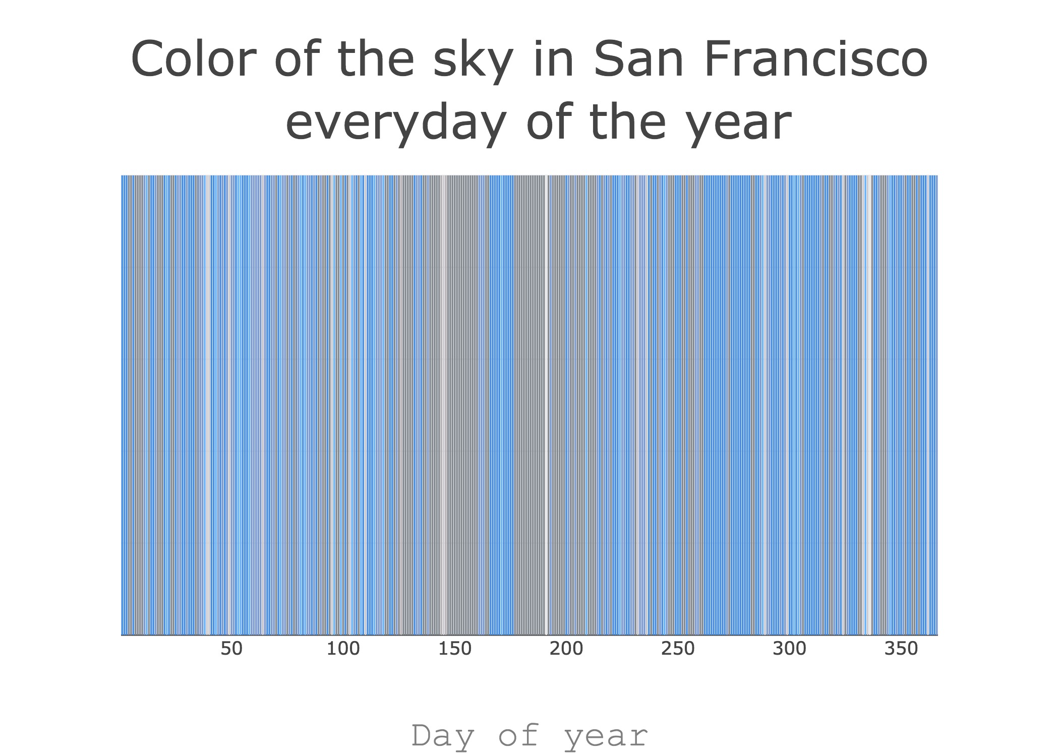
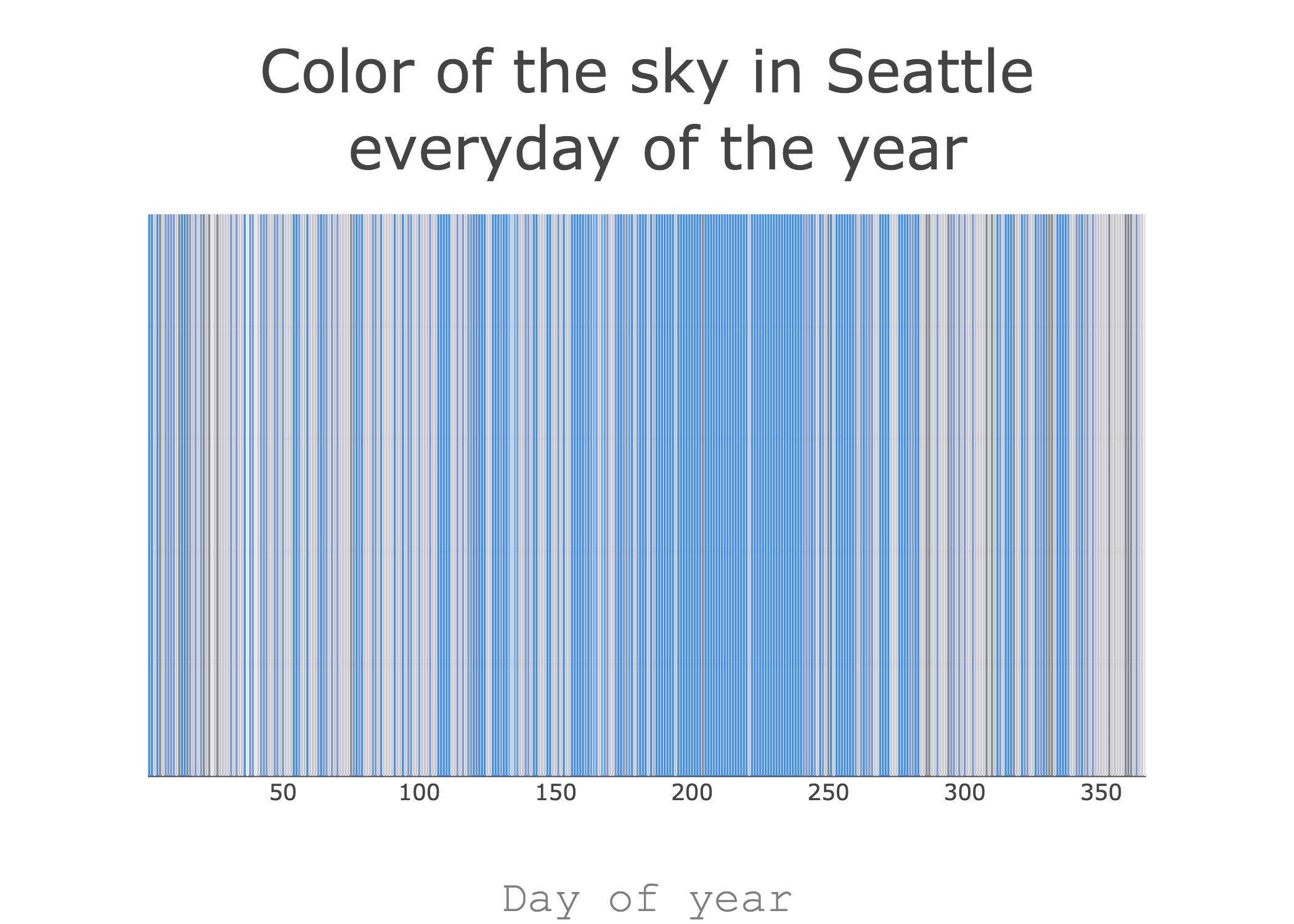
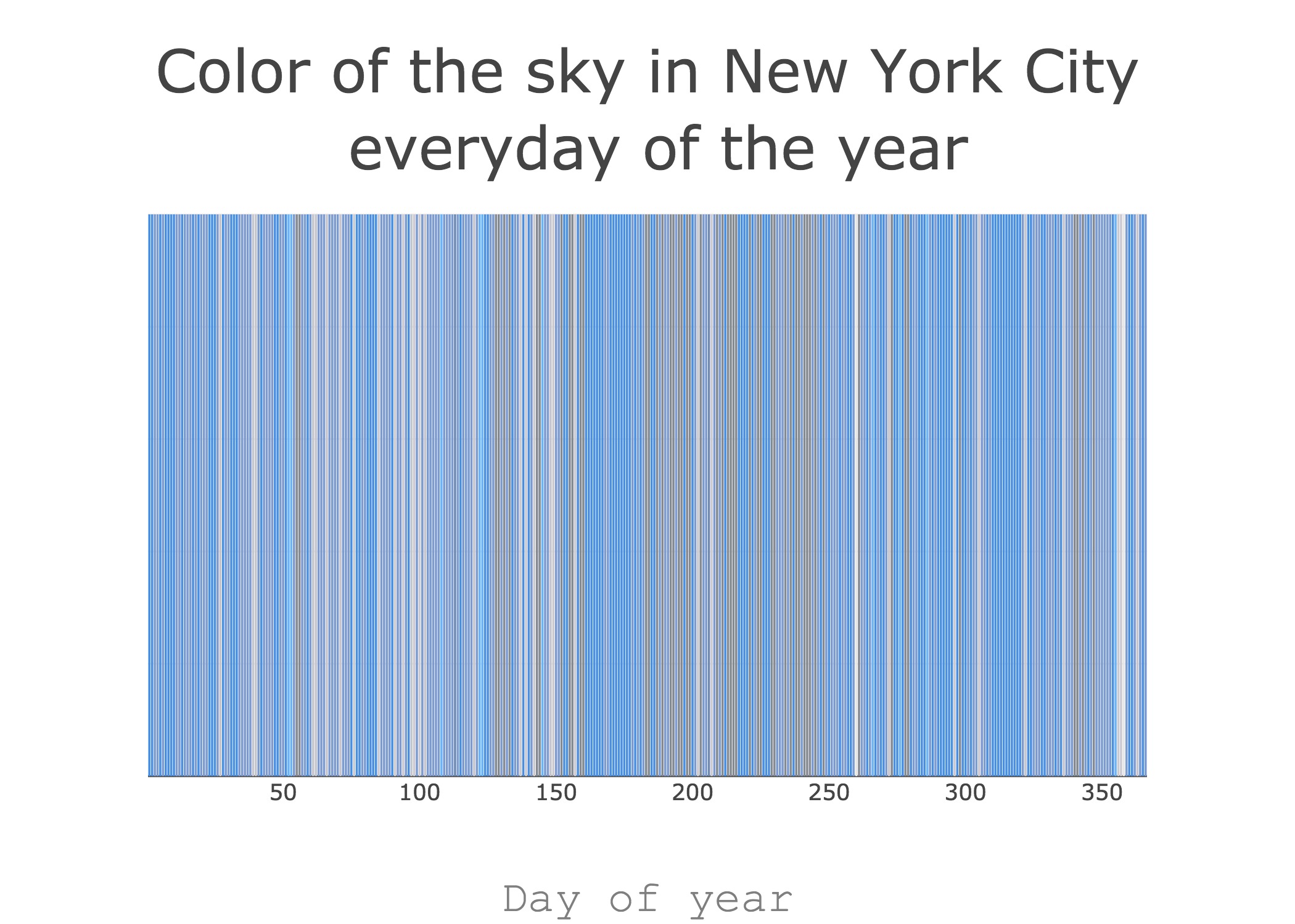
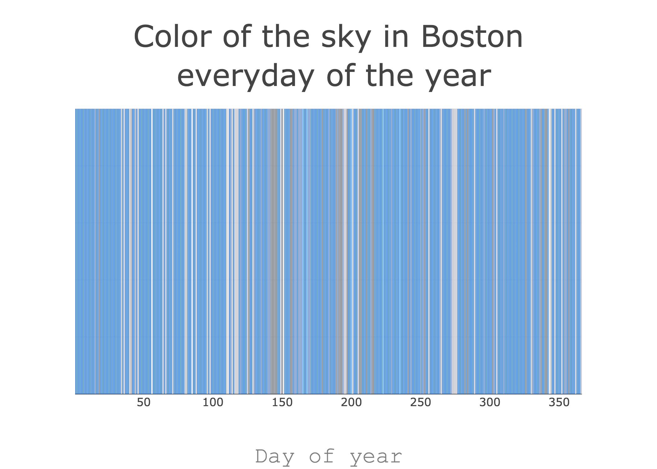
So I decided to make a simple data visualization: I made vertical bar charts where from left to right the most frequently occurring color of the sky everyday of the year is shown. I made these bar charts for the major tech-hubs I identified in the weather database I found to visually see just how different the color of the sky is in these cities throughout the year.
 Because this project is based on open data provided by an Israeli (data from an open database on Kaggle provided by David Beniaguev. ) and Tel-Aviv is definitely a major tech-hub also, a bonus plot:
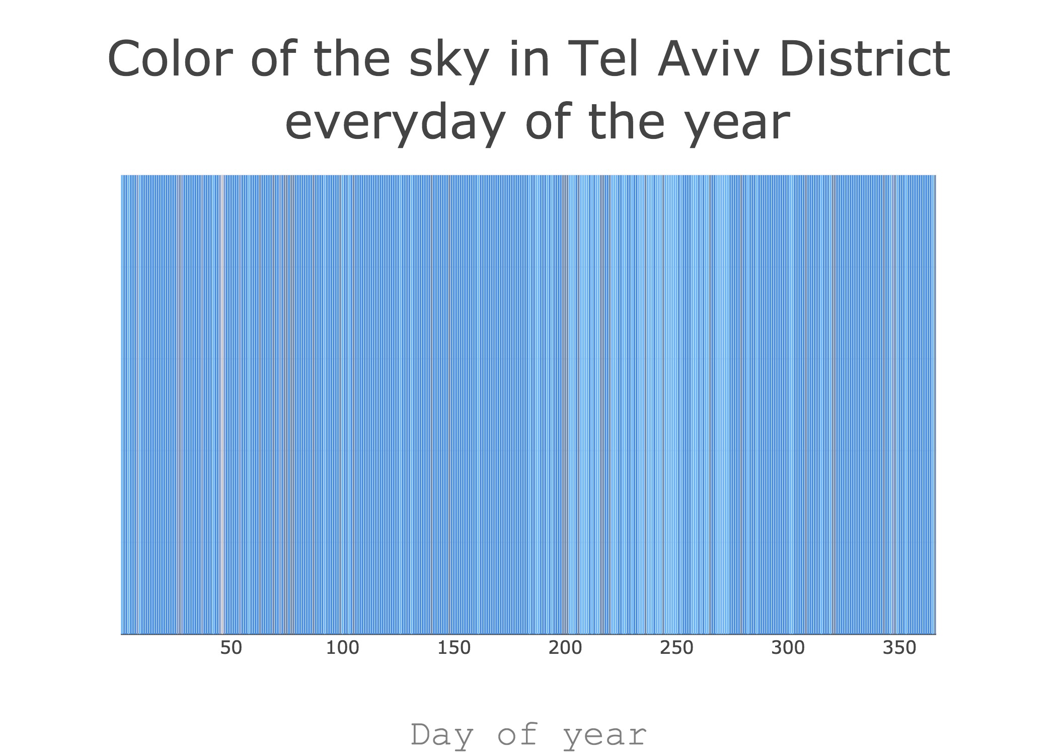 In the data visualizations above you’ll see the color of the sky in the tech hubs of western hemisphere everyday of the year throughout the year. The plots are bar plots. Each bar in the bar chart represents one day, there are 365 bars corresponding to the days of the year, and each bar is a color that is the most frequently occurring color of the sky on that day in that city over the past few years.
Methodology
I found a database of hourly weather data for cities on Kaggle.
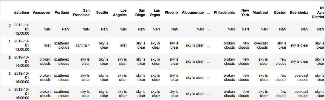
Raw data file from Kaggle
I extracted weather data for one city at a time from the raw data file. I mapped each date to day of the year. I calculated day-of-year from the year-month-day value. For example, 2015-01–01 is mapped to 1 as 1st Jan is the second day of the year and 2016-01–02 is mapped to 2 as 2nd Jan is the 2nd day of the year. I discarded data for what qualifies, roughly, as night time. As we are concerned with the differences in the colors of the sky and the color of the sky is always same at night we can disregard weather data for night time.
For each day-of-year for most hours I had multiple weather descriptions. Because I wanted to see what the sky looks like most often I chose the mode of the weather description value for each hour, i.e., I chose the most frequently reoccurring or most common weather description for each hour of each day. Similarly, because I wanted to visualize one color for one day I filtered the data further and discarded the hour values to keep only the day-of-year values and the most frequently reoccurring or most common weather description for each day of the year.
I now had a column of day-of-year and a corresponding column of weather descriptions.
At the very beginning of my data processing I had listed all the distinct weather descriptions that were there in the raw data for all cities. I then stored key-value pairs of the weather descriptions and their rgb color values. I calculated the rgb values using my Mac’s Digital Color Meter. I searched on Google Images for each distinct weather description (except for the different types of thunderstorms, I repeated the rgb values for those) and then used the Digital Color Meter to record the rgb value of the color of the sky from a relevant image search result. The process was extremely tedious, inefficient and subjective but perfectly adequate. I merged this information with the column of day-of-year and a corresponding column of weather descriptions such that the weather descriptions now had their color values associated with them and therefore, each day-of-year had a color value associated with it also.
Finally, I made a vertical bar chart such that each bar represents one day, the bars in the chart represent day 1 through day 366 of the year and the color of each bar corresponds to, what is according to my subjective opinion, the color of the sky on that day as per the weather description of that corresponding day of the year.
I used Pandas for my data analysis and Plot.ly to make the bar charts. You can see all the code, formatted as a step-by-step tutorial, for this project in this Jupyter NotebooK.
This project is based on data from an Open Database on Kaggle provided by David Beniaguev. Thank you David!